Invitation
A Phantom of the Opera themed Invitation
A Phantom of the Opera themed Invitation

A Visual made for the Gods.
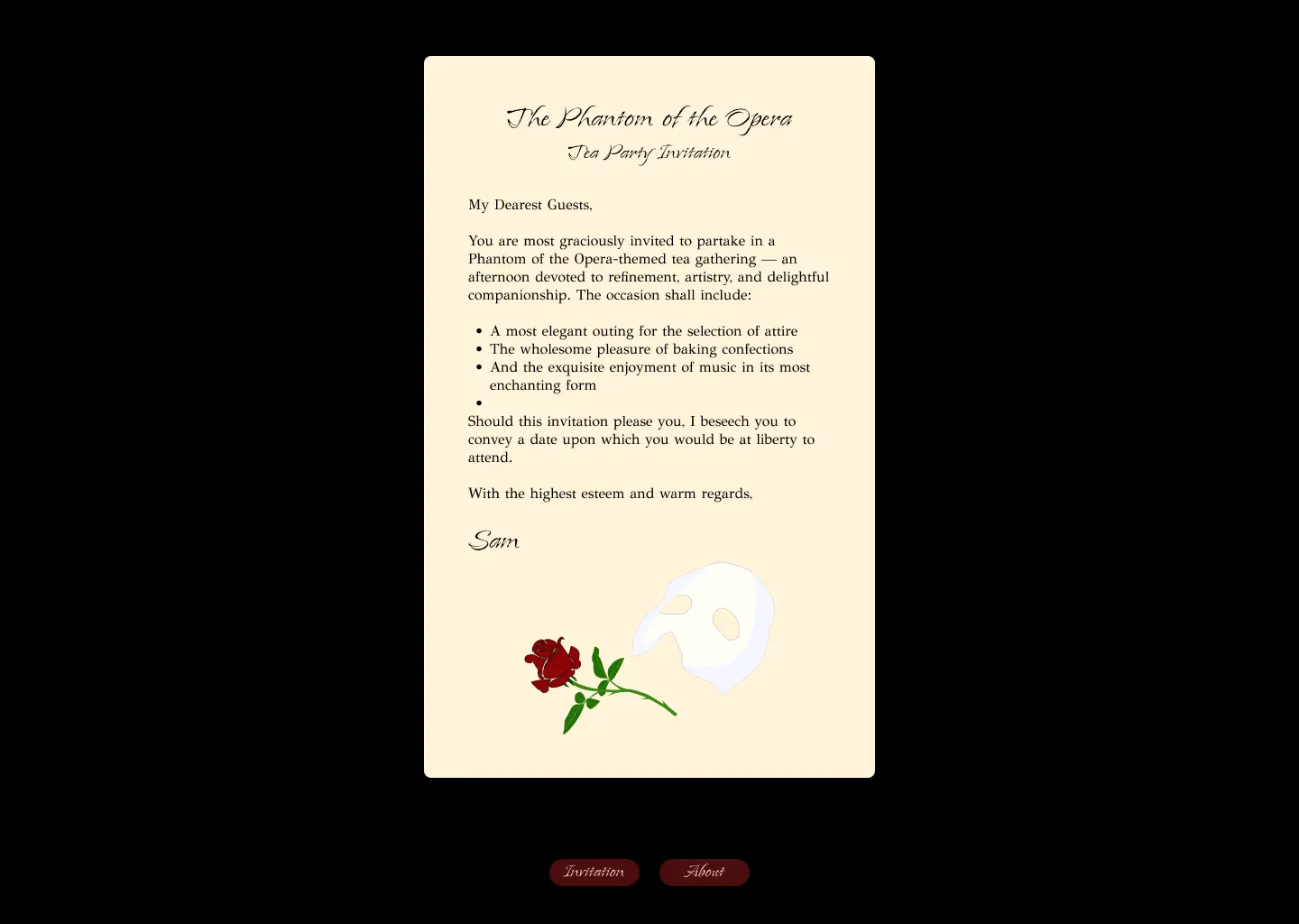
This project is an interactive digital invitation for a tea party
inspired by The Phantom of the Opera. It combines narrative,
atmosphere, and interaction to create an immersive experience.
Through this project, I explored my interest in themed design,
storytelling, and experiential concepts. I was able to combine my
skills in design, Figma, and front-end vibe-coding. The project was
developed quickly but with clear intent over the course of two days.
This project strengthens my portfolio by clearly showcasing my
personal style and my ability to translate a concept into an
interactive digital experience.
This project brings together narrative, atmosphere, and interaction in a single digital experience. It demonstrates how an invitation can go beyond static design and become a storytelling tool that immerses the viewer in a specific theme and mood.
For this personal project, I designed a digital invitation with
the goal of creating an immersive and atmospheric experience
inspired by
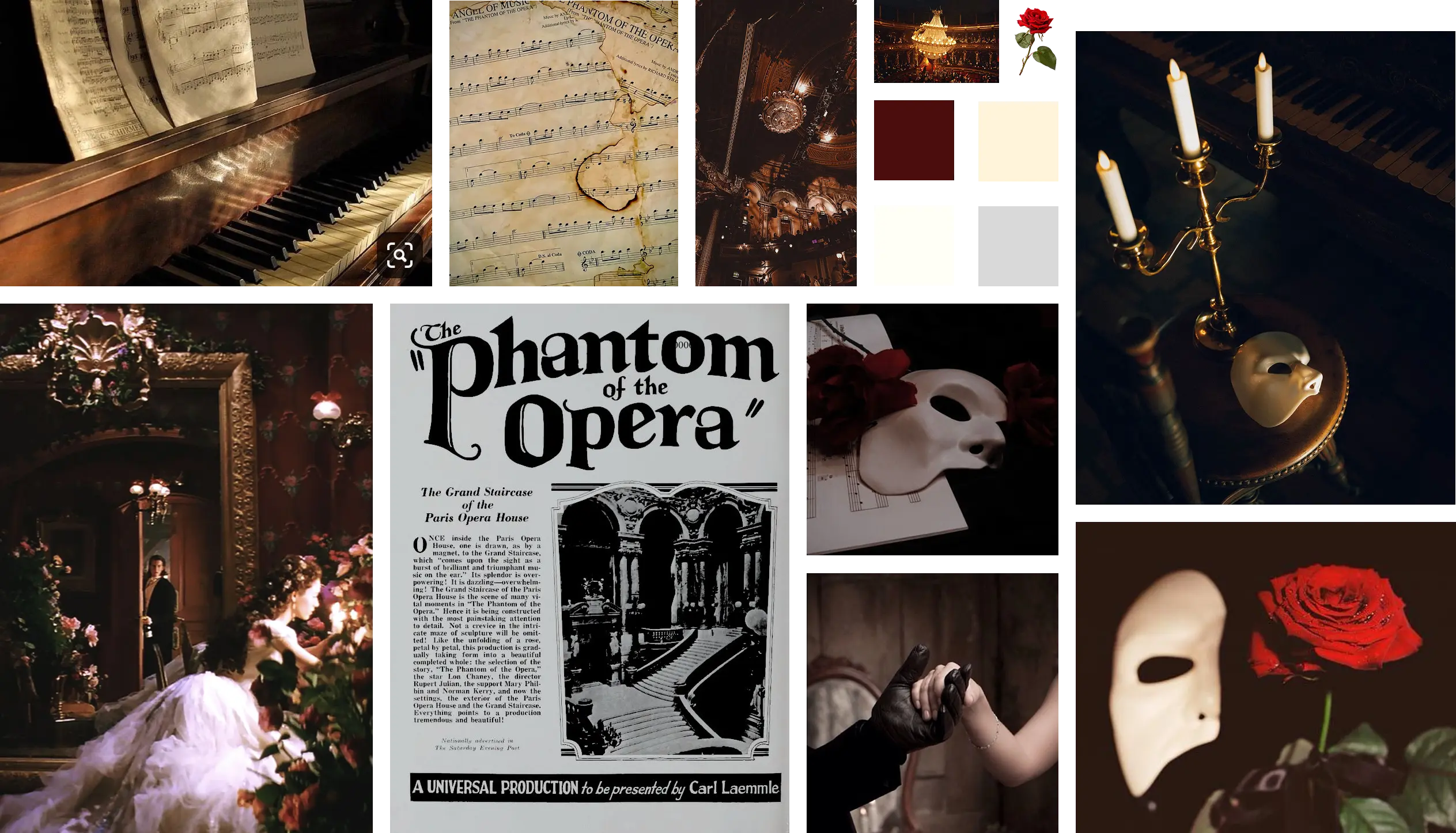
The Phantom of the Opera. I began the process with visual
research on Pinterest, collecting imagery related to opera,
candlelight, masks, roses, and baroque elegance. These visuals
were brought together in a moodboard that formed the foundation
for the dark, romantic, and theatrical atmosphere of the project.
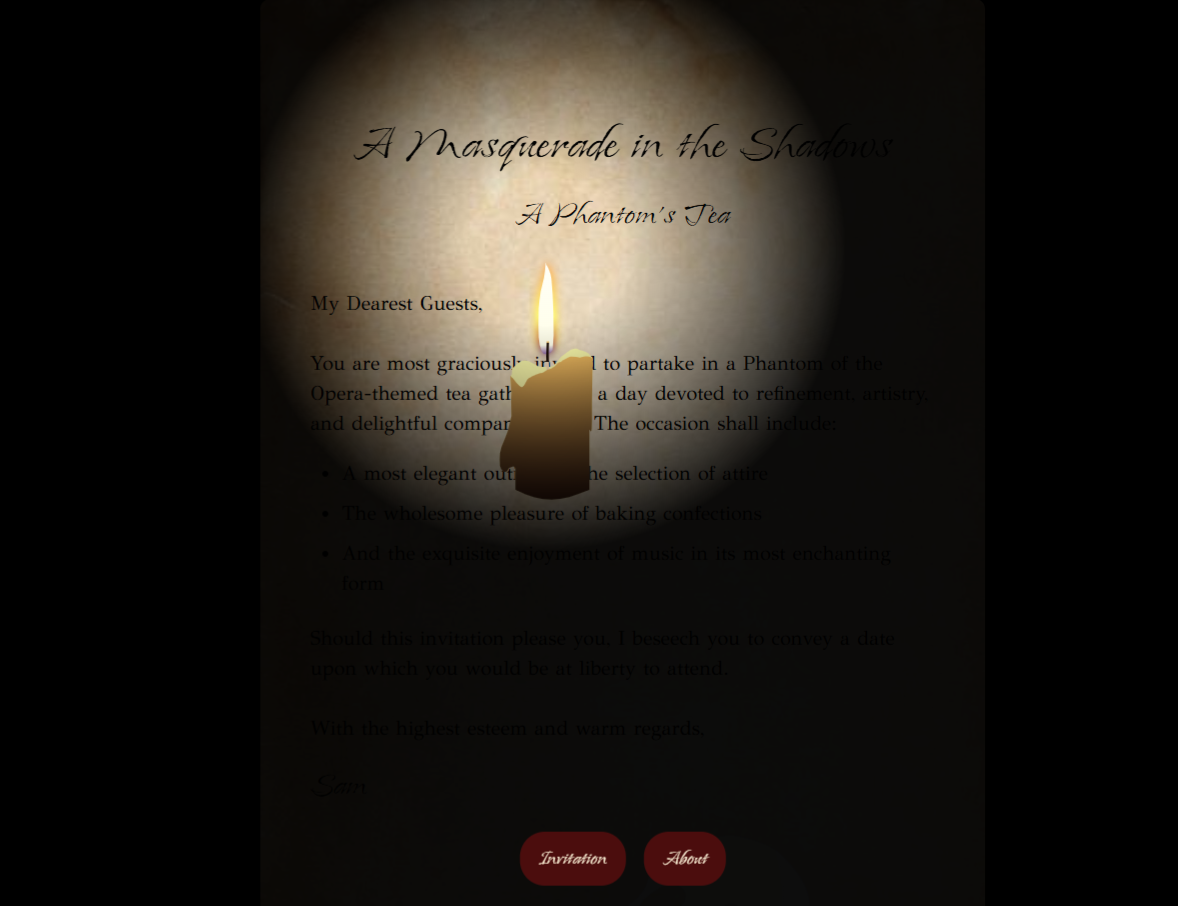
I then wrote the invitation text in a formal and poetic tone,
fitting the timeless and mysterious world of
The Phantom of the Opera. The typography choices
reinforced this feeling: Island Moments for the title to create an
elegant, handwritten look, and GFS Didot for the body text because
of its classic and luxurious character.
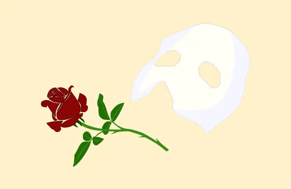
To further enhance the atmosphere, I created digital illustrations
of the mask and the rose as direct references to the film. I also
designed a digital candle, which later became a key interactive
element within the invitation.
During the coding phase, I translated the design into an
interactive digital experience. The main page presents the
invitation text and illustrations, initially hidden behind a
digital curtain inspired by an opera performance. As the
candlelight is revealed, the text gradually appears, enhancing the
mysterious and theatrical mood. Additionally, I designed an extra
about page that provides background information about the film.

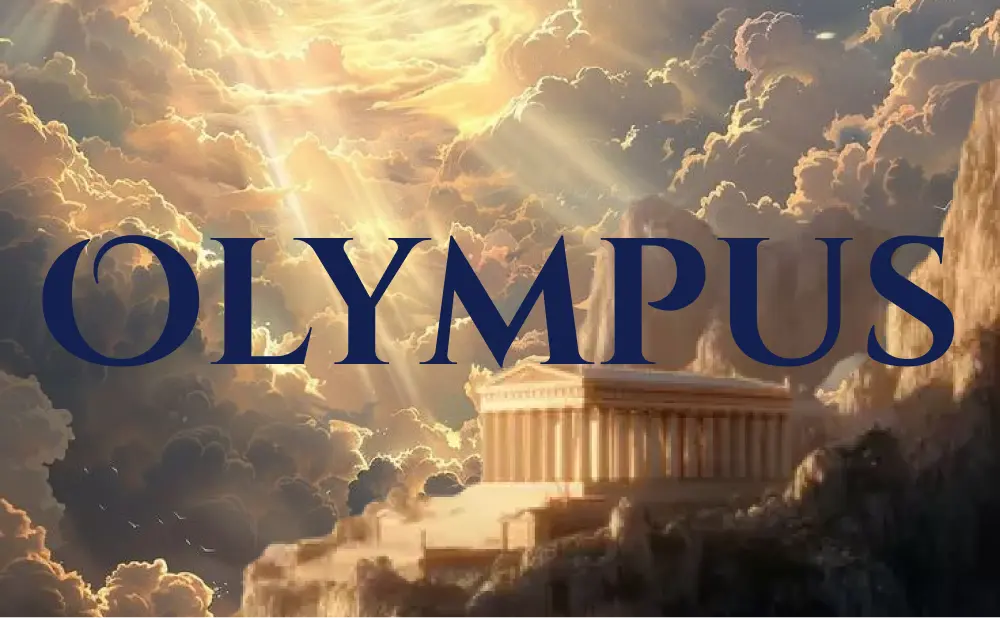
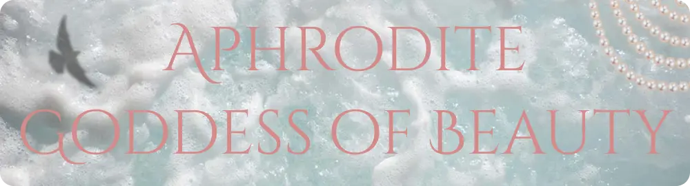
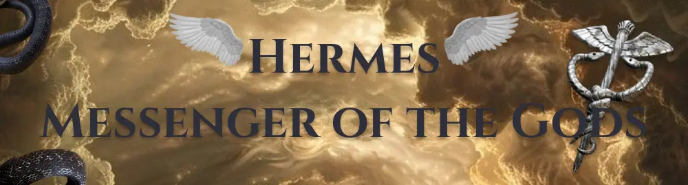
In this ongoing project, I am designing a visual identity for the gods
of Olympus. The project consists of moodboards, color palettes, and
typographic systems, created to give each god a distinct identity
while maintaining visual cohesion across the entire pantheon.
Olympus strengthens my portfolio by adding depth, scale, and visual
consistency, while showcasing long-term, independent work.
This project demonstrates conceptual and systematic thinking, as well as my ability to work consistently within a larger visual framework. It strongly aligns with branding, storytelling, and experience design and reflects my perseverance and independence through its long-term nature.
For the design of the thirteen gods, I followed the same design
process for each deity in order to maintain consistency, while
still allowing every god to develop a unique visual identity.
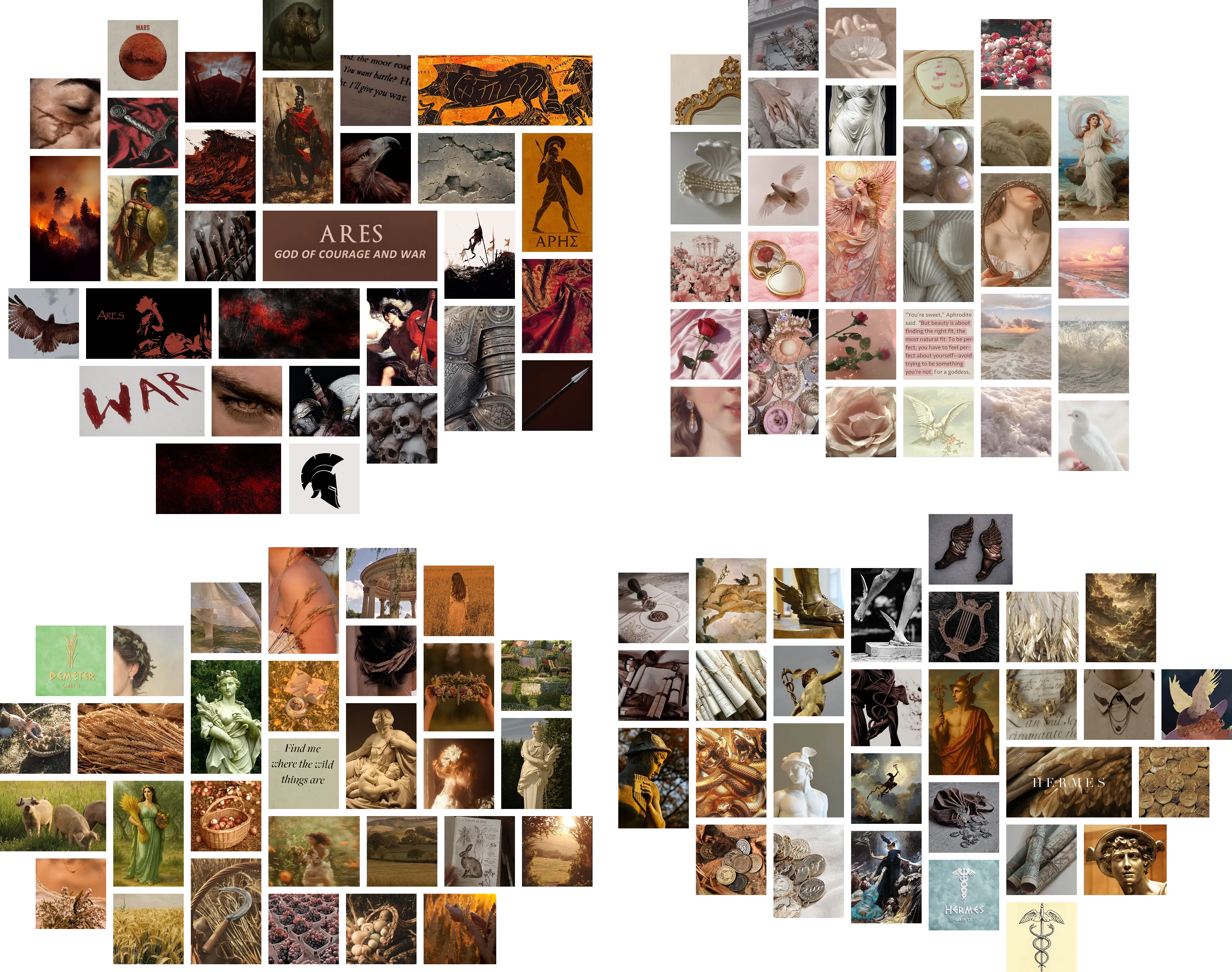
For each god, I started by creating a moodboard. I gathered
inspiration through Pinterest, focusing on imagery connected to
the specific god or goddess. I selected visuals that reflected
their atmosphere, symbolism, and personality. This step helped
define a clear visual direction before moving further into the
design phase.
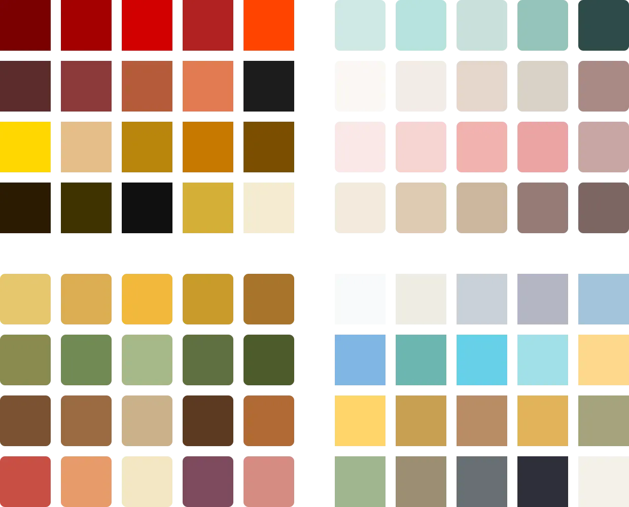
Based on the moodboard, I created a color palette for each god.
The colors were chosen to conceptually and visually align with the
character and meaning of the deity. This ensured that every god
felt recognizable and unique, while still fitting into the larger
visual system.
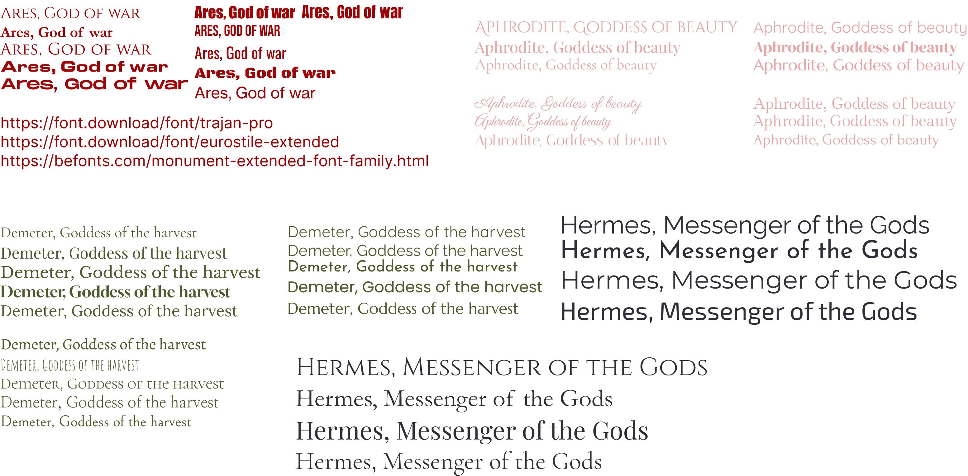
Next, I explored typography. I tested various typefaces and
combined them with the color palette to find the strongest match.
My choices were guided by readability, form, and atmosphere,
ensuring that the typography reinforced the identity of each god.
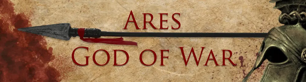
As a final step, I designed a name tag for every god. This stage
involved many iterations, experimenting with layout, typography,
color usage, and composition. By comparing multiple versions, I
was able to refine each design and ultimately select the version
that best represented the visual identity developed throughout the
process.

 LinkedIn
